Design challenge

Redesign the desktop support chat UI to mobile 📱.

Workflow

Interogate the brief

Future state research & mood board

Build

Reflection

Learning outcomes

Resize and scaling for mobile

Design process learnings

Interogate the brief

"Convert the ui chat for the Norwegian school for mobile."


I'm focusing on two key parts of the brief: convert and mobile. I can expedite some design process parts as the groundwork has been done (mainly current state research). I'm also shifting my technical mindset to mobile design (sizing, spacing, etc.).

"Redesign the UI chat for the Norwegian school for mobile."


Picking apart the brief I'm focusing on two key parts, convert and mobile. So I'm instantly thinking that I can expedite some of the design process parts as a lot of the groundwork has been done (mainly current state research).


I'm also thinking in terms of mobile design, so shifting my technical mindset that way (eg sizing, spacing, etc).

Future state research & moodboard

I conducted future state research to ensure I wasn't jumping the gun and ratified a few design decisions. Upon inspecting current chatbot implementations, I decided to change some features slightly.

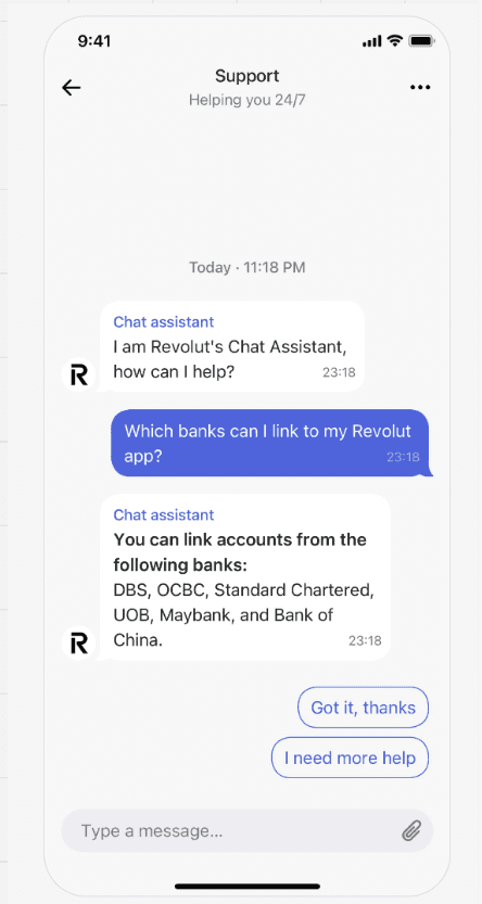
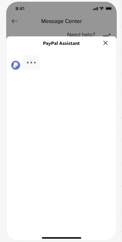
Due to mobile's limited retail space compared to desktop, many current chatbot implementations on mobile utilise the full screen right away. For my design challenge implementation, I will shift focus away from an expanding chat window on desktop in favour of a chatbot view that takes up almost the height of the screen.

I want to drop the height shy of the full screen to mimic the second screenshot present. I feel this still gives the user some visual cues of where they are in the app and the chatbot overlayed, so should they wish to end the chat, they can continue where they left off and not have to try to backtrack.

Build

The build process was straightforward. I used a screenshot of the University of Stavanger's mobile site for sizing. I duplicated the web support chat and reworked it on top of the mobile frames. Once the support chats were placed in the mobile frames, I correctly constrained them within their containers.

Reflection

This design challenge was straightforward and allowed me to learn where previous work can expedite parts of the design process.

Another key learning was the transfer of designs between desktop and mobile. I thought this would require more resizing and time, but it was simpler than expected, and I completed it in a shorter time frame.
Check out some more of my work

UI Recretaion

Stoic

UI Recretaion

Burnley Savings and Loans

Blog

UI Recreation Process

Design Challenge

Back to UX Basics

Design Challenge

Client Landing page

Blog

CV

Check out some more of my work

UI Recretaion

Stoic

UI Recretaion

Burnley Savings and Loans

Blog

UI Recreation Process

Design Challenge

Back to UX Basics

Design Challenge

Client Landing page

Blog

CV

Check out some more of my work

UI Recretaion

Stoic

UI Recretaion

Burnley Savings and Loans

Blog

UI Recreation Process

Design Challenge

Back to UX Basics

Design Challenge

Client Landing page

Blog

CV

Michael Carey

Thanks

Thanks so much for taking the time to view my portfolio .

Michael Carey

Thanks

Thanks so much for taking the time to view my portfolio .

Michael Carey

Thanks

Thanks so much for taking the time to view my portfolio .