Design challenge

Client Intranet landing page

Workflow

Interogate the brief

Future state research & mood board

Build

Reflection

Learning outcomes

Auto layouts in Figma

Text Contrast

Animated Mesh Gradients

Interogate the brief

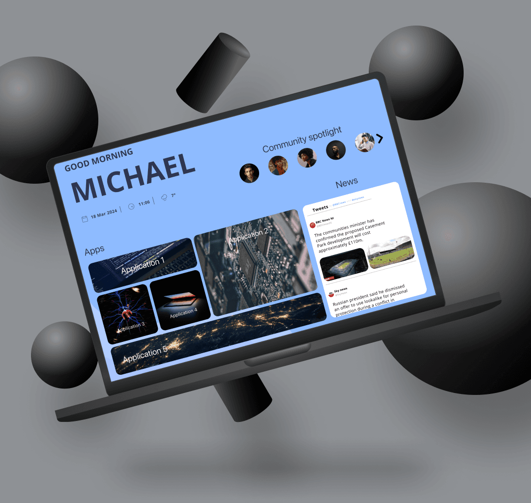
The client has requested an intranet dashboard to serve as a central launch pad within their web landscape, enabling employees to access various tools seamlessly. The dashboard should incorporate personalised features tailored to individual employees, promoting a sense of community and collaboration within the organisation.


Key parts of the brief:

-central launch pad

-personalisation

-community

Future state research & moodboard

Currently, there is no existing implementation of the client's solution. Therefore, I began by delving into future state mood boarding and ideation based on the provided brief. Here are the key aspects I focused on:

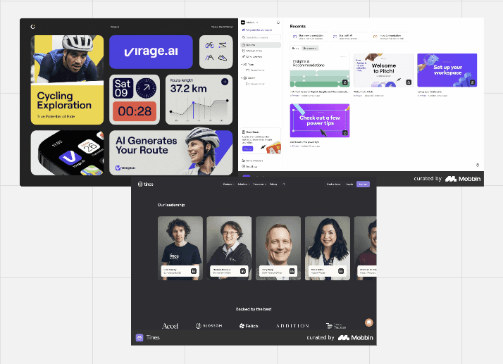
1. Central Launch Pad: I am drawn to the concept of using card-based elements to organise different tools for employees to navigate. However, I recently came across the "bento design" UI pattern, which features interaction cards or images of varying sizes that slightly overlap, resembling a sushi bento box.

I believe adopting this approach will allow me to group the central launch pad elements effectively, reducing the user's cognitive load by concentrating it within a condensed screen space. This design choice not only conserves screen real estate but also accommodates other essential elements on the screen.

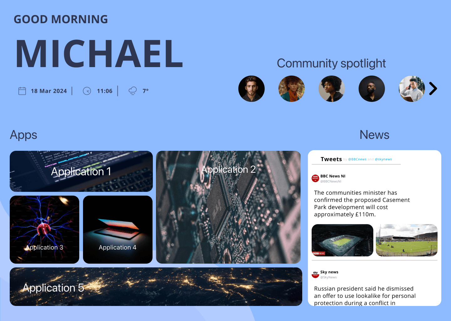
2. Personalisation: For personalisation, I envision a welcoming title displaying the user's name, accompanied by a few widgets showcasing the local date, time, weather, and news updates.

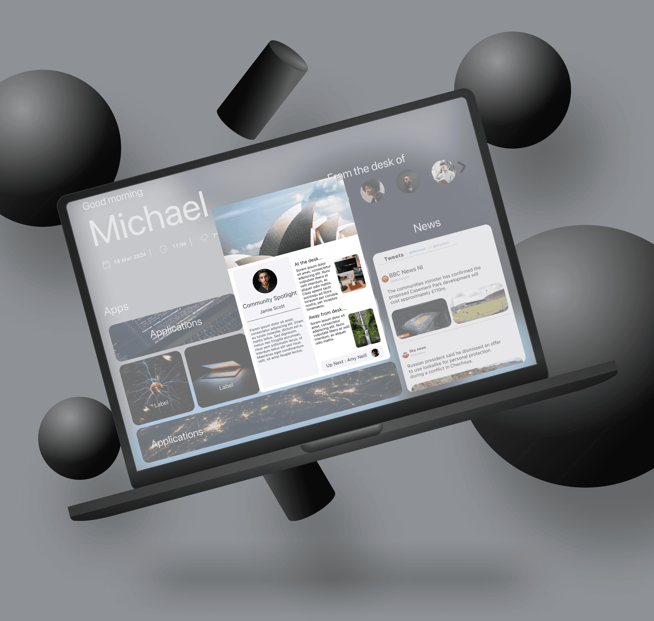
3. Community Integration: The client has a community initiative called 'Manual of Me,' which comprises a concise one-page document filled out by company employees, detailing their current work focus, past experiences, preferred contact times, hobbies outside of work, etc.

To enhance the community aspect of the project, I propose integrating this 'Manual of Me' concept. One effective way to showcase this is through a ticker carousel featuring employees' profile pictures. Clicking on a profile picture would lead to the respective employee's 'Manual of Me' page, facilitating connectivity and knowledge sharing within the company.

By incorporating these elements thoughtfully, we can create an intranet dashboard that not only serves as a central hub for accessing tools but also fosters a sense of personalisation and community among employees.

Future state research & moodboard

Currently, there is no existing implementation of the client's solution. Therefore, I began by delving into future state mood boarding and ideation based on the provided brief. Here are the key aspects I focused on:


1. Central Launch Pad: I am drawn to the concept of using card-based elements to organise different tools for employees to navigate. However, I recently came across the "bento design" UI pattern, which features interaction cards or images of varying sizes that slightly overlap, resembling a sushi bento box.


I believe adopting this approach will allow me to group the central launch pad elements effectively, reducing the user's cognitive load by concentrating it within a condensed screen space. This design choice not only conserves screen real estate but also accommodates other essential elements on the screen.


2. Personalisation: For personalisation, I envision a welcoming title displaying the user's name, accompanied by a few widgets showcasing the local date, time, weather, and news updates.


3. Community Integration: The client has a community initiative called 'Manual of Me,' which comprises a concise one-page document filled out by company employees, detailing their current work focus, past experiences, preferred contact times, hobbies outside of work, etc.


To enhance the community aspect of the project, I propose integrating this 'Manual of Me' concept. One effective way to showcase this is through a ticker carousel featuring employees' profile pictures. Clicking on a profile picture would lead to the respective employee's 'Manual of Me' page, facilitating connectivity and knowledge sharing within the company.


By incorporating these elements thoughtfully, we can create an intranet dashboard that not only serves as a central hub for accessing tools but also fosters a sense of personalisation and community among employees.

Build

I began by crafting the welcome message content and accompanying widgets. These elements were assembled using text and icons (sourced from a stock website), with auto layout applied for organisation and alignment.

Next, I designed the community spotlight carousel. This involved creating avatar frames with rounded corners to form visually pleasing avatar circles, duplicating them and adding a contextual left and right arrows for when different states are surface. these were then assembled with auto layout and converted into a component set. This was topped of with hover state interaction applied to the avatar component and a clickable action applied that when clicked the clients community spotlight doc for that employee is surfaced.

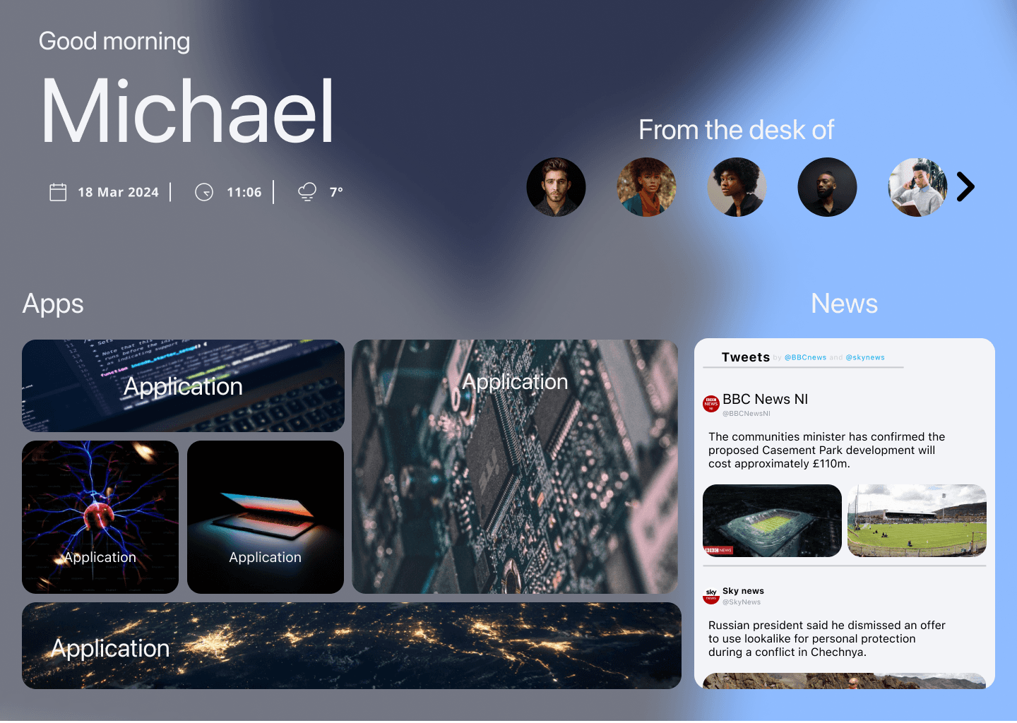
The next part of the build focused on the Bento box. I started by creating individual elements of various sizes using text, frames, and autolayouts, then converting them into a component.

I applied a hover state to these components, that bumps the transparency of the background up, enlarges the text, and smart animates it, providing nice user feedback when hovering over a Bento element.

I then stared to place these individual components into the main design frame, utilising auto layout, constraints, and absolute positioning to achieve the desired Bento effect of overlapping elements across each other.

The final component of the build was the newsreel located on the right-hand side of the main design window. It was crafted using text, frames, auto layouts, and constraints to achieve the desired appearance. Additionally, frame clip content was applied to portray that this is a scrollable window that users can interact with.

Iteration 1 summary

In summary of iteration one, this exercise was valuable and enjoyable. I particularly appreciated experimenting with auto layouts and absolute positioning for the creation of Bento box, which was challenging but rewarding in terms of learning nuances in layout design.

Regarding the carousel, it was enjoyable to create and added a fun element to the project. What made it particularly interesting was figuring out the prototyping interaction, such as when clicking a left or right arrow, which shifted the avatars accordingly, effectively portraying the interaction concept.

Regarding the difference between versions one and two, version two places the carousel below the bento box. This means that desktop users would need to scroll down to view the community spotlight carousel in version two, whereas in version one, it was conveniently located in the top right-hand corner of the screen.

Personally, I prefer version one because it is a more streamlined approach presenting all relevant info and features up front and eliminates the need for added scrolling effort.

Iteration 2 build

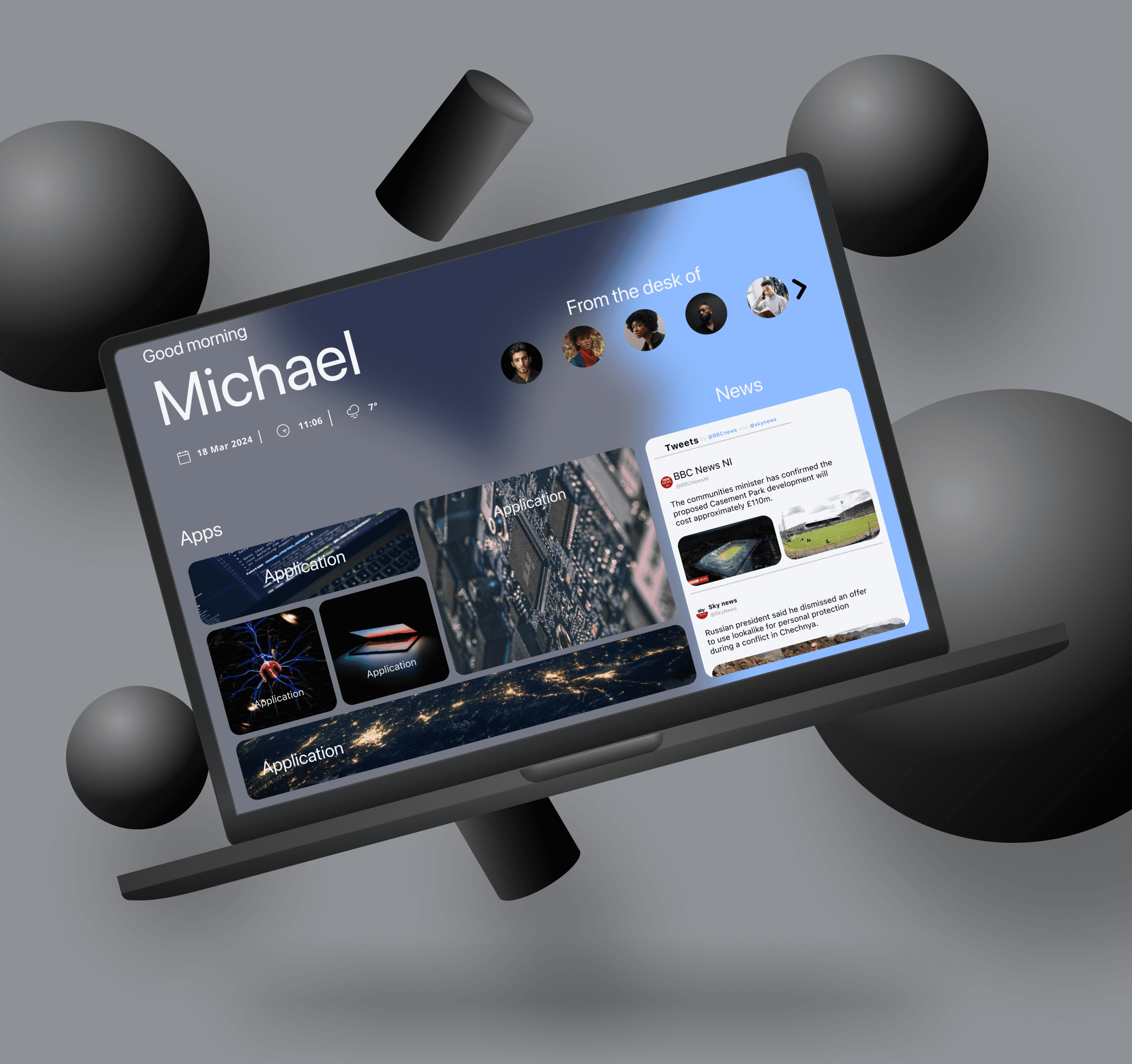
Iteration two retained the Bentobox and social elements, such as the news reel, local date-time, and weather.

The only enhancement to common on in version two was the inclusion of a mesh gradient background with animations. To achieve this, I developed distinct blob components customised with the client's colour scheme. These components were then placed into a frame, the frame duplicated, and the blobs strategically moved to different places. A smart animation interaction was implemented to smoothly transition between frames, creating a dynamic effect with the moving blobs.

Finally, a Gaussian blur was applied over the background, which was positioned behind the overall design frame. The Bentobox and other elements were placed on top of this layered background for a cohesive visual presentation.

Iteration 2 summary

In iteration two, implementing the mesh gradient was enjoyable. It's a trendy design pattern currently, which adds a cool factor to the interface.

However, my main concern revolves around the clients colour scheme of the blobs and their dynamic interaction with the background and especially concerning the contrast levels and legibility of the typeface when similar colours are used and the animation overlaps them. This can impact accessibility negatively. Fine-tuning and tweaking are necessary to ensure a harmonious colour palette that complements each other even during animations, enhancing readability and accessibility.
Check out some more of my work

UI Recretaion

Stoic

UI Recretaion

Burnley Savings and Loans

Blog

UI Recreation Process

Design Challenge

Back to UX Basics

Design Challenge

Client Landing page

Blog

CV

Check out some more of my work

UI Recretaion

Stoic

UI Recretaion

Burnley Savings and Loans

Blog

UI Recreation Process

Design Challenge

Back to UX Basics

Design Challenge

Client Landing page

Blog

CV

Check out some more of my work

UI Recretaion

Stoic

UI Recretaion

Burnley Savings and Loans

Blog

UI Recreation Process

Design Challenge

Back to UX Basics

Design Challenge

Client Landing page

Blog

CV

Michael Carey

Thanks

Thanks so much for taking the time to view my portfolio .

Michael Carey

Thanks

Thanks so much for taking the time to view my portfolio .

Michael Carey

Thanks

Thanks so much for taking the time to view my portfolio .