UI Recreation
Stoic
Introduction
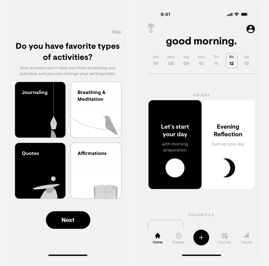
Stoic is a mental health companion designed to help you understand your emotions, boost happiness and productivity, and overcome challenges. It prioritise simplicity, offering a range of tools that support without overwhelming—there when you need them most.
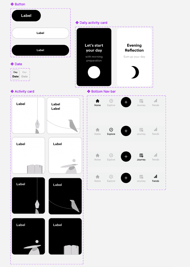
For this project, I wanted to focus on improving my typography skills, particularly matching typefaces precisely. In my previous UI recreation, I observed a lot of variations in size and character spacing, so this time I aimed for accuracy in the typeface to see if this would be similar. Stoic was an ideal choice for its simple UI, including buttons, activity cards, a weekday display bar, and a navigation bar, all with active and inactive variants—perfect for me to not be bogged down in ui element s intricacies and could focus on typography.
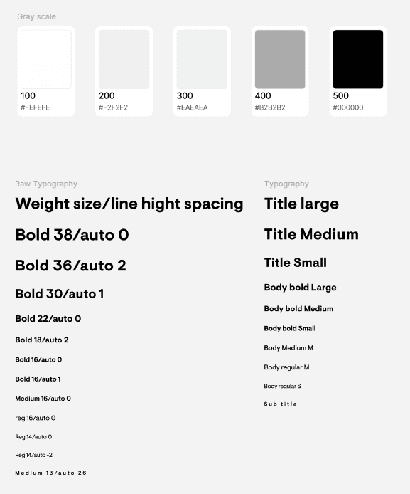
Using the Stoic website and browser inspector, I identified the app’s typeface, “Visuelt Pro”.
Observations
Typography Accuracy:
By using the same font as the original app, I achieved better consistency in font size, character spacing, and overall text styling. However when I was creating there text style in Figma for use, I found that my naming conventions lacked directness and consistency, something to think about and refine.
Icons:
Similarly to the previous UI recreation, I couldn’t source the exact icon set Stoic uses. Instead, I selected similar icons from a public library that conveyed the same information to the user. It’s unclear whether Stoic uses publicly available icons or a bespoke set, Is there a way to find this out similarly to inspecting their website for typography?
Advanced Figma Tools:
For one screen, I used Figma’s advanced tools, specifically the subtract feature, to create a crescent moon shape. This was a new and rewarding experience, allowing me to expand my familiarity with Figma’s capabilities while enhancing the design’s visual quality.
Overall this UI reaction allowed me to enhance my typography skills by understanding typefaces, weight, size, and character spacing and the relationship they have with one another.
