Design challenge
Back to UX Basics
Workflow
Set the goals
Set the interactions
User flow
Mood board
Mock ups
Hi Fi build
Reflection
Learning outcomes
Revision of Basic UX process
Rapid UX work
Figma UI kit
Intro & Brief
Set the Goals
The brief for the challenge "Design a set and forget it app to manage home solar panels".
The goals:
Review current panels.
Check their current electricity consumption and set it to a specific value.
Assign specific appliances to a selected panel.
Set the interactions
The screens and interactions:
Log in
Sign up
View dashboard of current panels
View details of a selected panel
Set the electric consumption of a selected panel
Add an appliance to a selected panel
Add a new panel
View list of appliances
Add a new appliance
Allocate an appliance to a panel
User flow
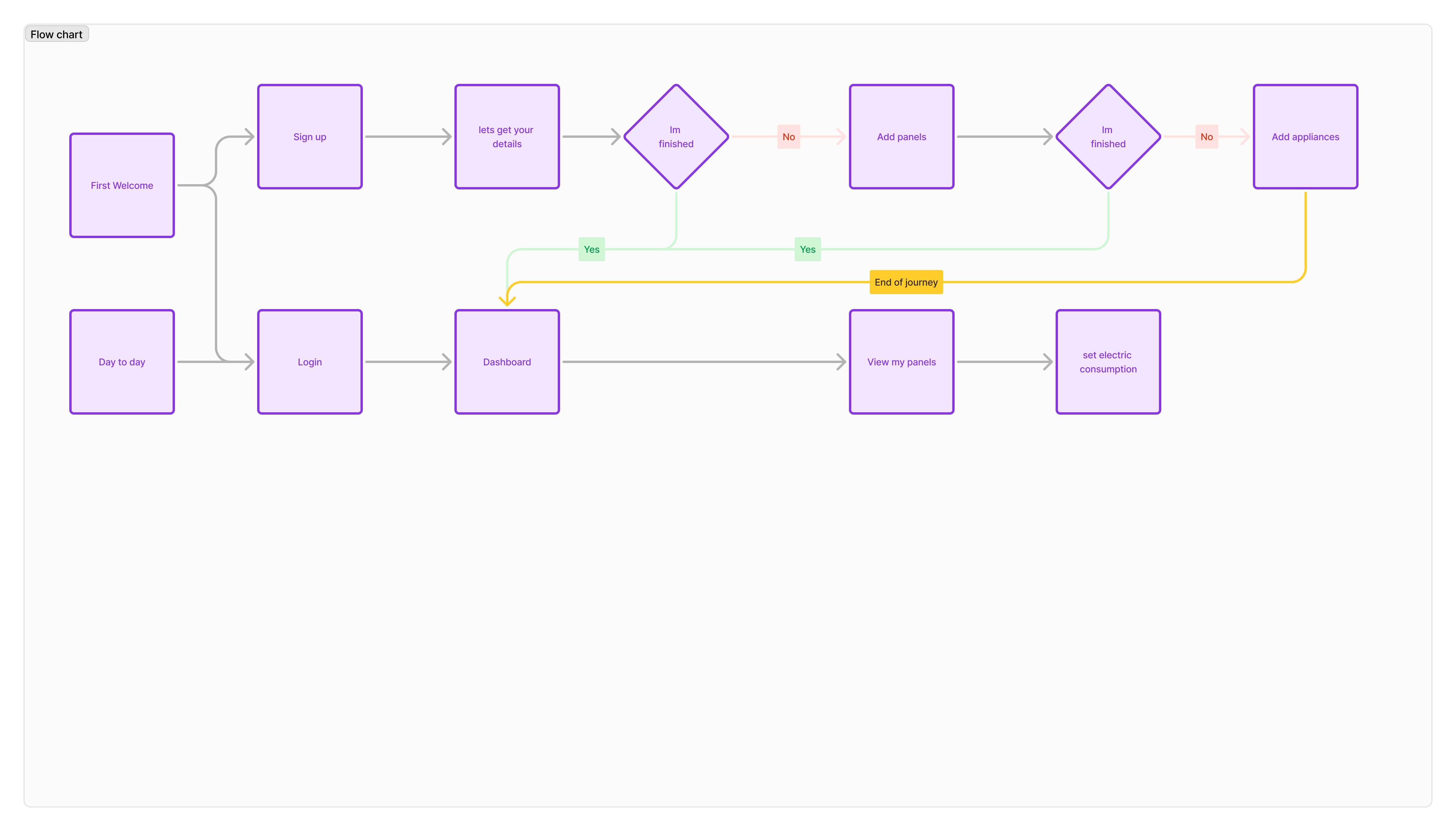
With the goals and screens established, the next step was to outline with a user flow artefact the onboarding journey and the day-to-day view of the dashboard and panel detail journey.
Mood baord
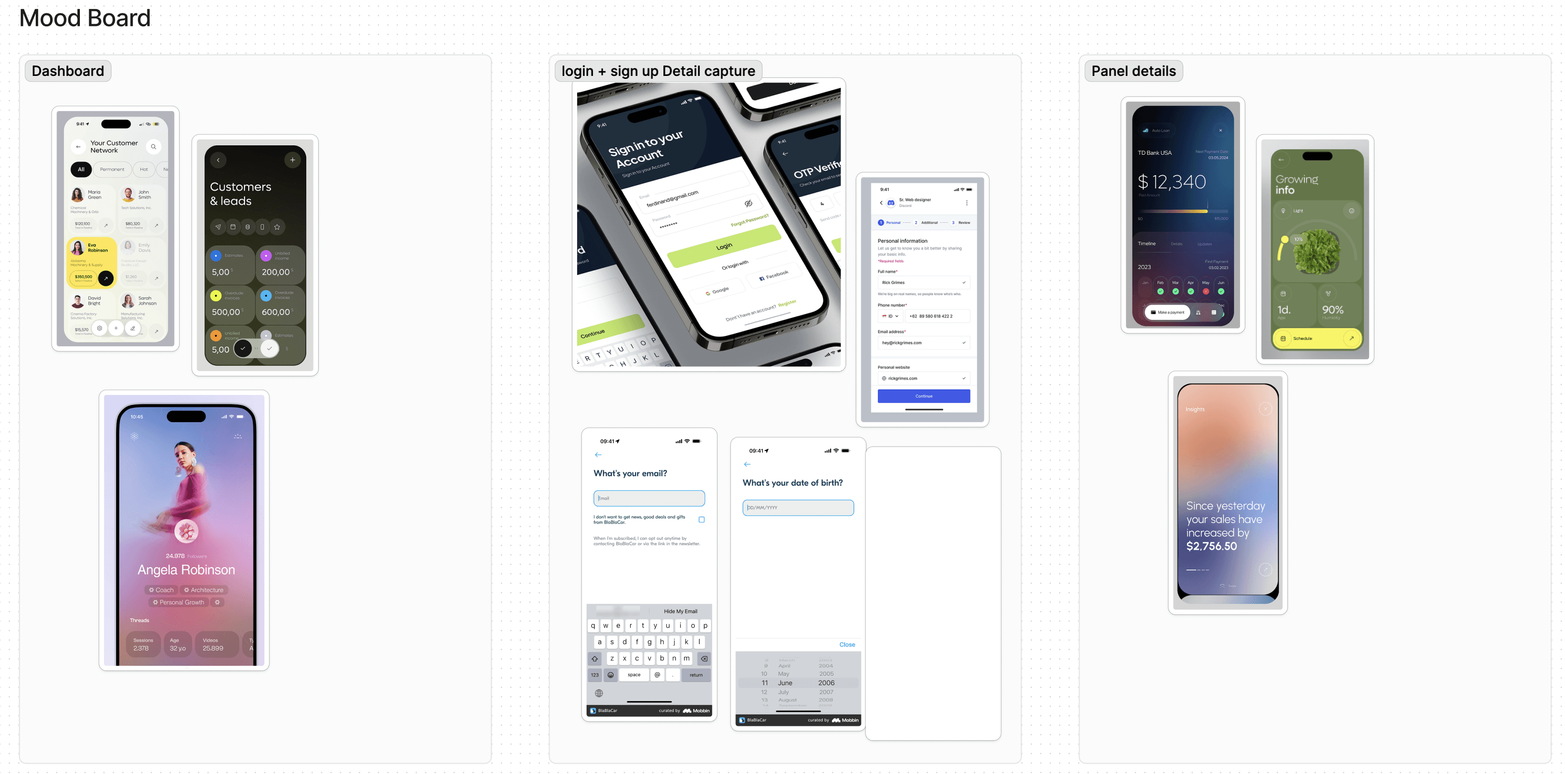
The next step involved mood boarding to find inspiration for different parts of the user flow.
Mock ups
Low-fidelity mockups were created to translate some of the mood board ideas onto paper.
Hi Fi build
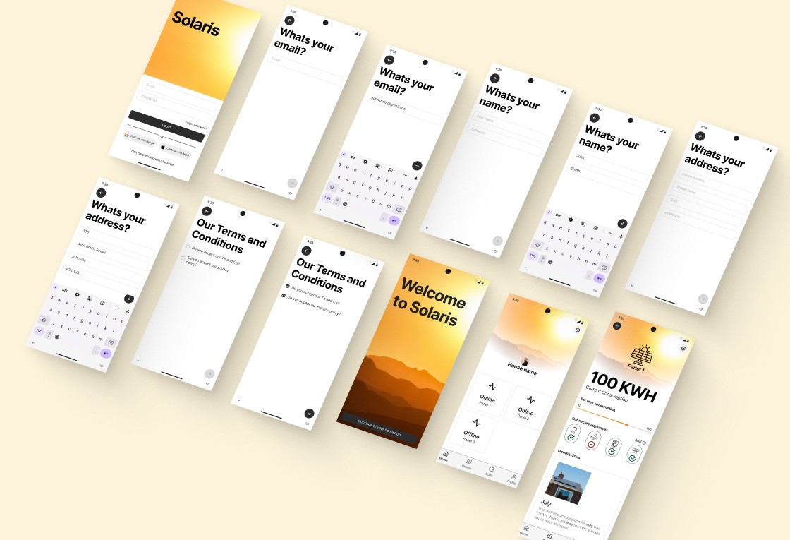
For this HiFi build, I wanted to maintain a layered approach. My first pass through the journey focused on setting up the page titles and input boxes. On the second pass, I layered in Figma’s UI kit components, such as the top system bar, bottom bar in the dashboard with appropriate icons, and the system keyboard.
In the third layer, I addressed the inactive and active states of progress buttons, input fields, checkboxes, and the various screen states reflecting these interactions. Finally, I added graphics to give life to key pages, such as the starting page, welcome page, and dashboard.
Reflection
Reflecting on this project, there are a few key points and observations I'd like to highlight.
I appreciated that this small UX project was framed as a "back to basics" exercise. It allowed me to move through the stages quickly, dedicating just a couple of hours each day over a week to set goals, define user flows, do some mood boarding, and create the HiFis. This approach let me tackle each part of the process efficiently, without getting bogged down in the details.
However, one downside of this style of design challenge is that the solution is already provided. This means we miss out on the initial stages of the design process, such as conducting user research, defining "how might we" statements, and identifying the problem before arriving at a solution. This is a significant limitation of this project, as it skips the essential first half of the design process.
Lastly, working with Figma for the HiFi build was a refreshing change. I've done several projects using iOS UI kits, so it was nice to explore a different UI kit, learn about different naming conventions, and understand the various variants and properties for components that might not be present in Apple or Android kits.
