Design challenge

Design a support chat UI for a school in Norway 🇳🇴.

Workflow

Interogate the brief

Current state research

Future state research & mood board

Build

Reflection

Learning outcomes

Intersecting shape to make custom atoms

Autolayouts in Figma

Figma build process

Interogate the brief

"Design a support chat UI for a school in Norway"

Refining the brief, I've decided to focus on university education establishments, as I believe university students (prospective or current students aged 17/18+) would be more likely to interact with a support chat.

To address this assumption, user research across a spectrum of students and parents of students would be valuable to establish the target users of this support bot.

To further refine the challenge, I've initially opted for a web platform solution. This decision is based on the assumption that most support chat interactions happen when a user is spending more time at a device looking for specific information. This assumption could also be validated with user research.

Current state research

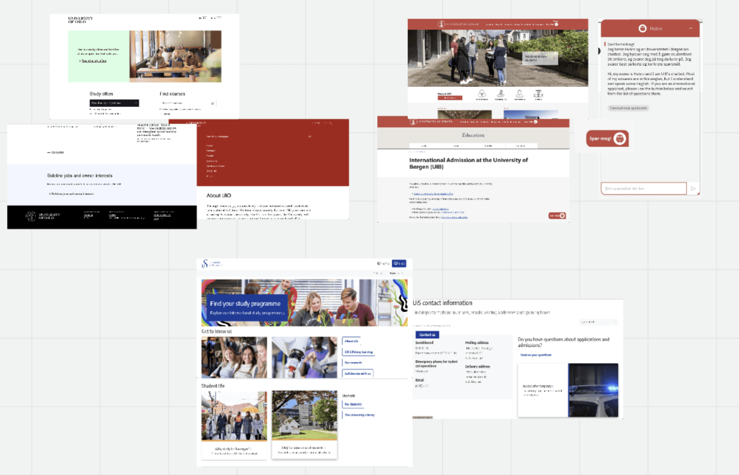
I inspected a few Norwegian Universities websites to refine the chatbot solution's look and feel.

  • University of Bergen (top right of the current state mood board) has a support chat, so I ruled them out.


  • University of Oslo (top left of the current state mood board) lacks a support chat. Their clean website uses a white and pastel colour palette, a mix of serif and sans-serif typefaces, and minimal text to push users down the IA tree.


  • University of Stavanger (bottom center of the current state mood board) also lacks a support chat. Their clean website uses a card UI pattern for navigation, royal blue as the primary colour, and various shades of gray. They use the 'Encode' sans-serif typeface.

I was more attracted to the University of Stavanger website due to its clean and consistent feel, so I will use it to refine my solution.

Future state research & moodboard

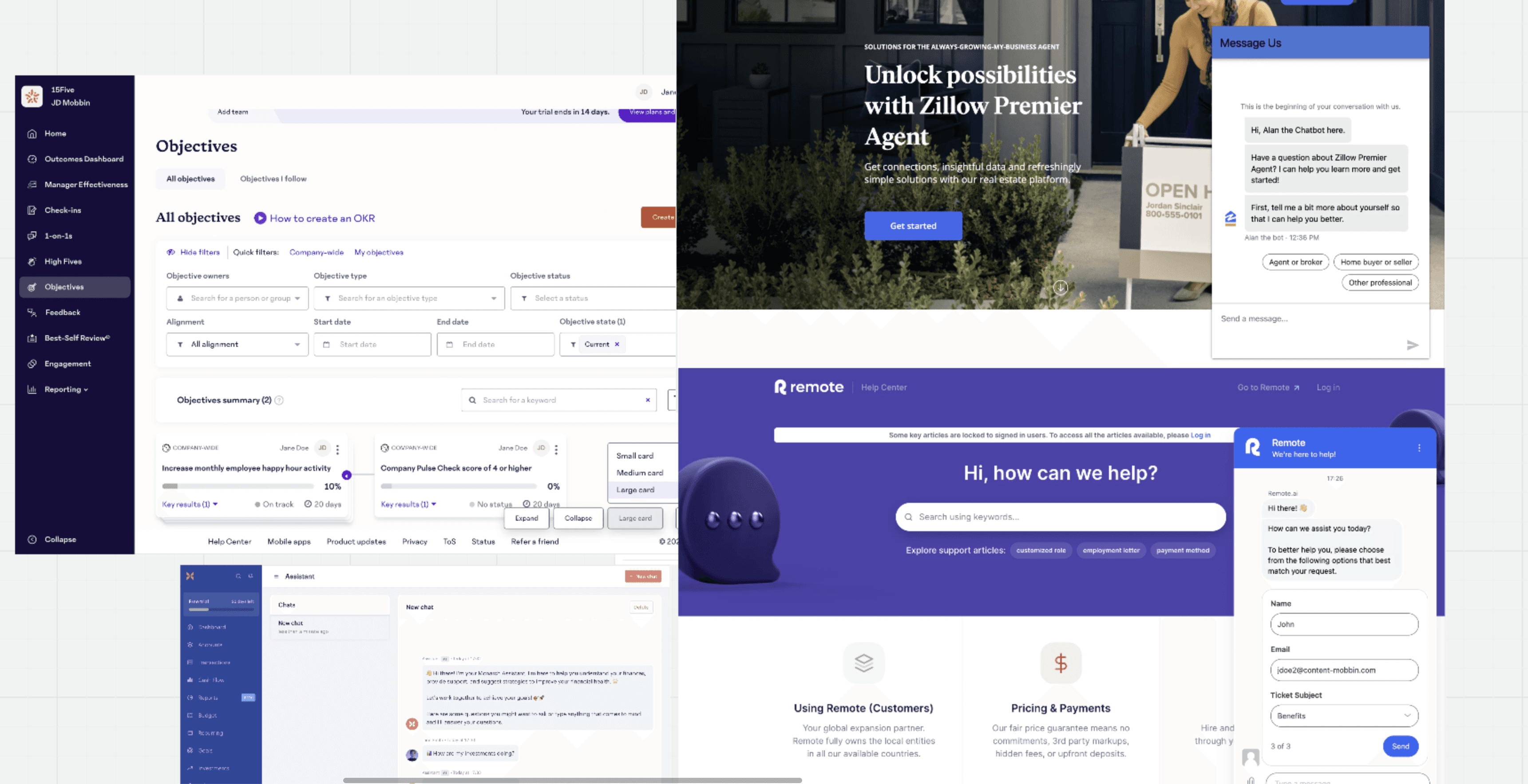
I researched the current state using Mobbin for inspiration. The top two screenshots show a common design pattern: a floating action button (FAB) in the bottom right for the initial presentation of a support chat when a user enters a site. I intend to follow this pattern to adhere to "Jakob's law" (the law of familiarity).

The subsequent screenshots show introductions from the support chat, pre-selectable choices for the user, a free text box, and an add attachment feature. The last screenshot displays an expanded view of the chat that takes up more screen real estate.

I like the pre-selectable choices that allow users to quickly access desired information. Additionally, I prefer the larger chat window as it keeps users engaged and minimizes distractions.

For my solution, I am considering an initial small support chat with pre-selectable options. As the user progresses towards their desired information, the chat window would expand, maintaining engagement and allowing for the presentation of more detailed information.

Build

I began by setting up the workspace with a colour palette square for quick eyedropper tool access and a desktop-sized frame with the university's website screenshot for sizing building blocks.

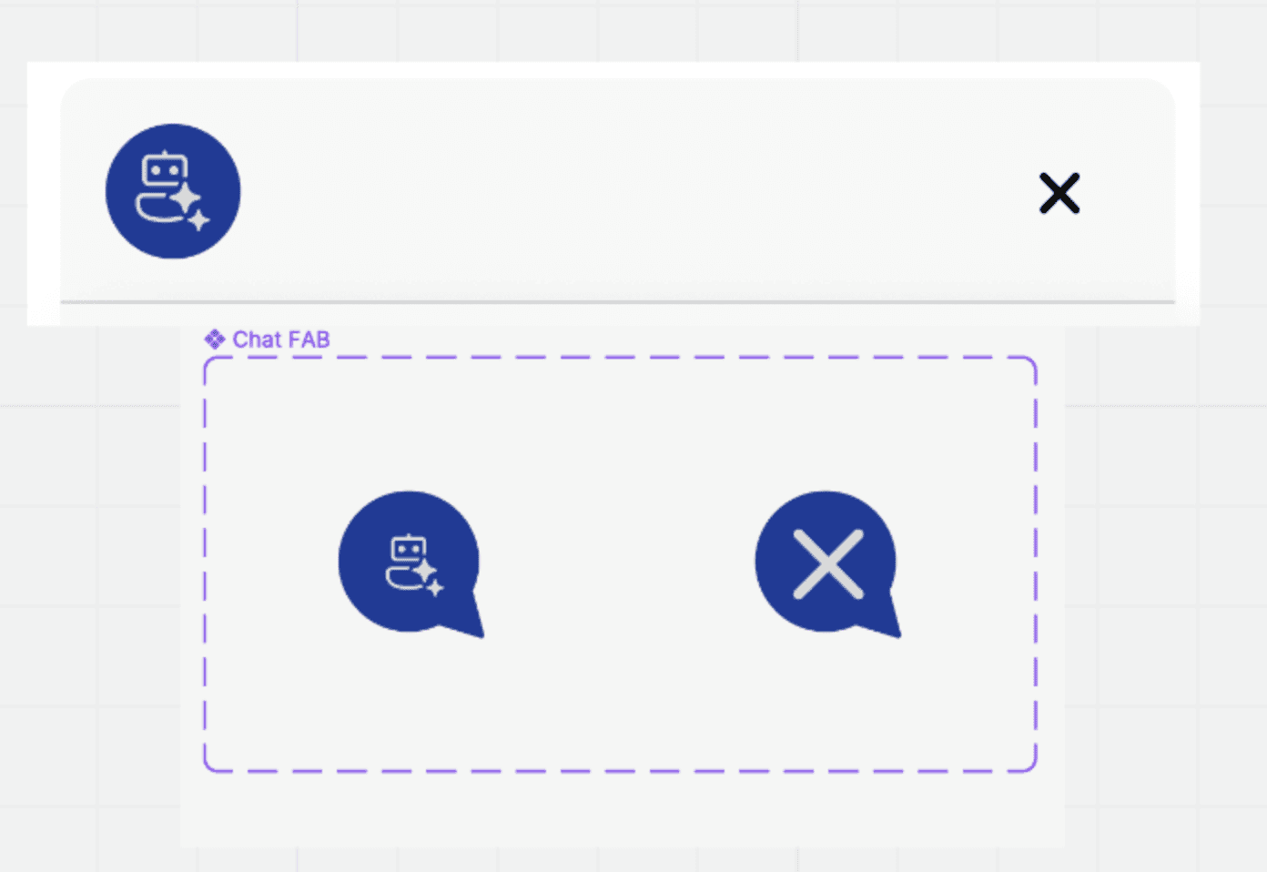
Next, I created reusable components, notably the Chat FAB with active and non-active states, using an ellipse with intersecting triangles for a speech bubble look and a UI kit icon set.

I then built the top bar using auto layout, incorporating the Chat FAB icon and close icon, applying auto gap, padding, background fill, rounding the top corners, and adding a stroke for differentiation from the main chat window.

Moving on, I created chat elements using auto layouts, ensuring sufficient gap, padding, and colour differentiation between user options and chat responses.

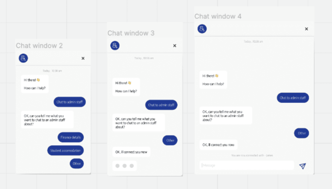
To maintain user focus, I designed the chat window to increase in size as the chat progressed, using a frame to house the chat window and top bar with appropriate contrasts for scaling.

For a polished look, I used the gray color from the palette as the base of the chat for an elevated aesthetic and added a drop shadow for enhancement.

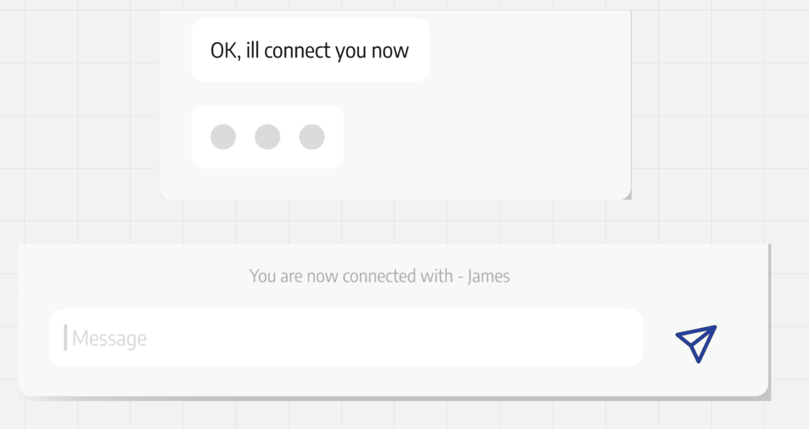
Lastly, I added user feedback elements: a 3-dot chat bubble to indicate chat construction and a text element to inform the user of agent connection. I aligned these on the screenshots to show the future implemented state and applied correct constraints to the chat window and FAB.

The set of screenshots below displays the end-to-end flow of the interaction.

Reflection

I realized I needed more knowledge of auto-layouts as I spent a significant amount of time adjusting chat elements as the journey progressed and more elements were introduced.

Prototyping the chat would allow for a better showcase of the chat window expanding as the conversation progresses.

Next steps:

  • Conduct user research to flesh out the pre-populated selections users would interact with and the associated generated responses.

  • Perform user testing on the prototype to gather feedback from users on the solution.

  • Iterate with release 2.

Check out some more of my work

UI Recretaion

Stoic

UI Recretaion

Burnley Savings and Loans

Blog

UI Recreation Process

Design Challenge

Back to UX Basics

Design Challenge

Client Landing page

Blog

CV

Check out some more of my work

UI Recretaion

Stoic

UI Recretaion

Burnley Savings and Loans

Blog

UI Recreation Process

Design Challenge

Back to UX Basics

Design Challenge

Client Landing page

Blog

CV

Check out some more of my work

UI Recretaion

Stoic

UI Recretaion

Burnley Savings and Loans

Blog

UI Recreation Process

Design Challenge

Back to UX Basics

Design Challenge

Client Landing page

Blog

CV

Michael Carey

Thanks

Thanks so much for taking the time to view my portfolio .

Michael Carey

Thanks

Thanks so much for taking the time to view my portfolio .

Michael Carey

Thanks

Thanks so much for taking the time to view my portfolio .