Design challenge
A button redesign challenge that supplies feedback to users.
Workflow
Interogate the brief
Current state research
Future state research & mood board
Build
Reflection
Learning outcomes
Button hover states and user feedback
Auto layouts in Figma
Design process learnings
Key learnings
Hover states and mobile dont mix
Linked text properties in variants
Interogate the brief
"Design a button hover state for the Tate Modern”.
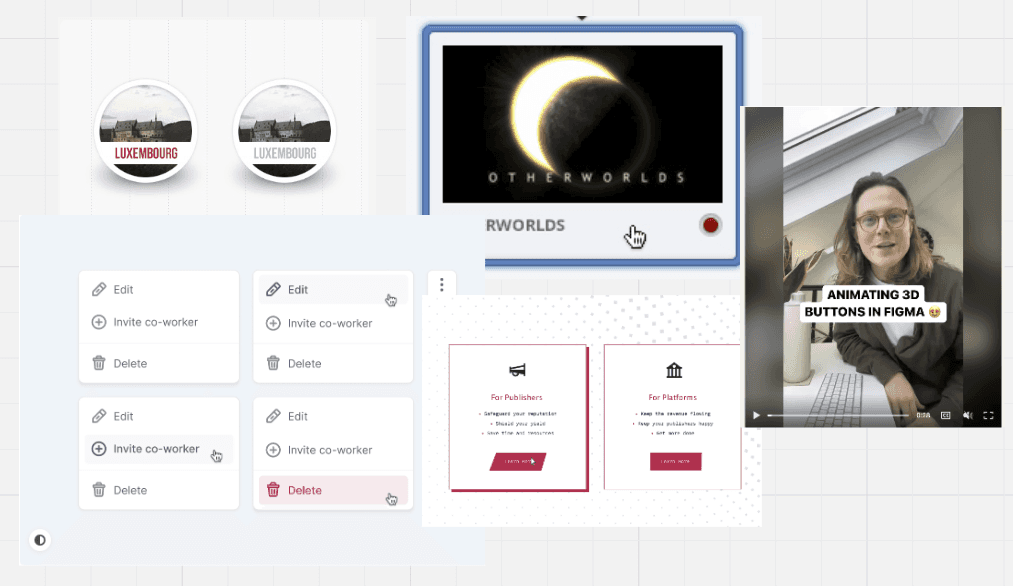
Diving into the brief, the key note to pick out is 'hover state' my thoughts go straight to onscreen user feedback and functional behaviour.
Current state research
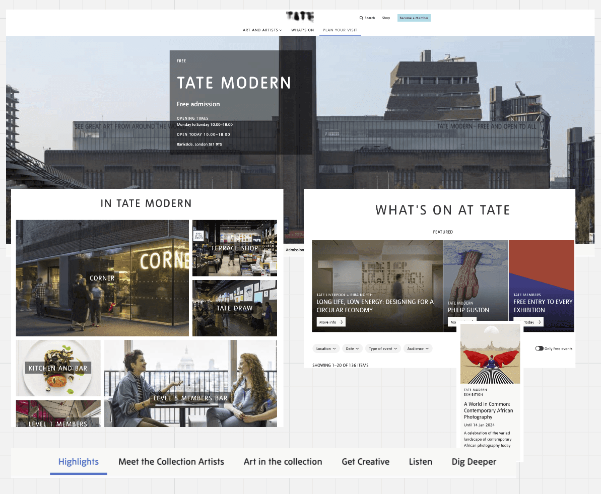
Reviewing the Tate Modern's website for aesthetic inspiration, I noted:
White and airy feel
Monochromatic primary color palette with transparency
Sans-serif typeface
They do not use a hover state in their navigation, only active and non-active states.
Build
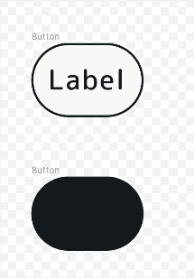
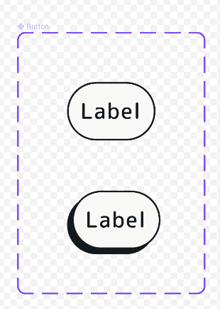
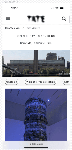
I used text and auto layouts to create the core button atom and its associated animation. I utilised a mobile screenshot of the current page for typeface sizing and padding.
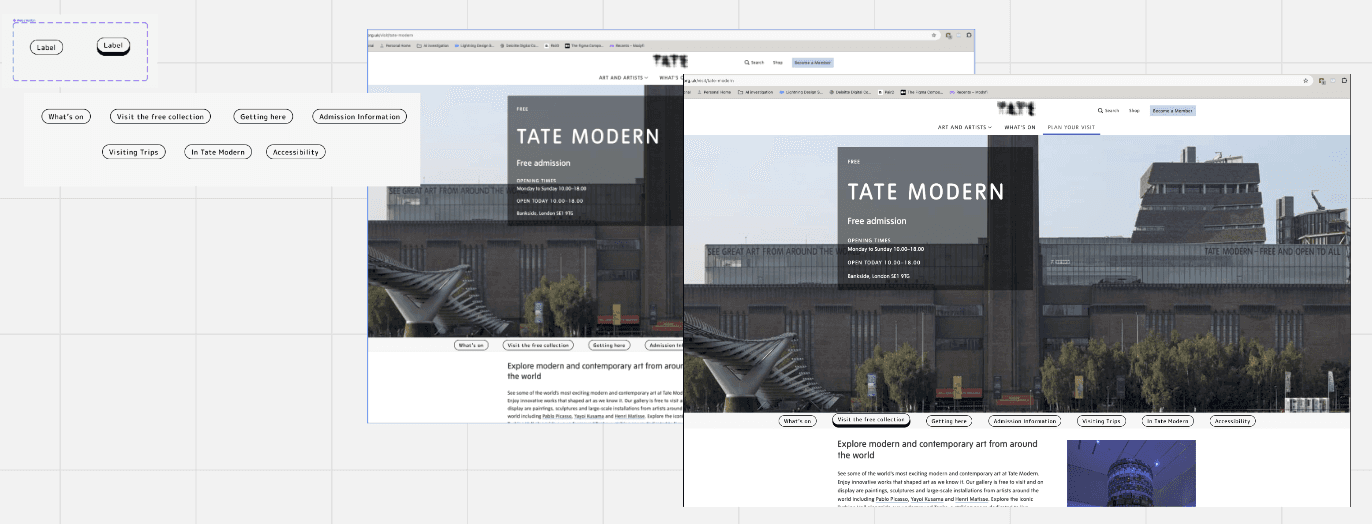
To create the tabbed navigation molecule, I duplicated the core button atom and applied an auto layout to all the buttons.
Finally, I made the molecule responsive by applying constraints to the mobile frame.
Reflection
Error number one, hover states do not lend themselves to touch screen mobile devices. They are more prevalent in applications that use cursor and click interaction (desktop). For mobile, a tap state would be a more effective way to portray user feedback.
Build two
Similar to the mobile build, I created the core button atom and its associated animation using text and auto layouts. I used a corrected web screenshot for typeface sizing and padding.
I duplicated the core button atom and applied an auto layout to all the buttons to create the tabbed navigation molecule.
Finally, I made the molecule responsive by applying constraints to the desktop screen frame.
Reflection two
Upon correcting the previous error, the correct steps were straightforward. Building the component involved the same steps, with the only difference being ensuring correct sizing, which was easily accomplished using a current website screenshot as a guide.
Pitfalls: The design challenge, provided by a challenge generator, lacked user research. The solution was developed based on my design judgment. Incorporating user research insights could lead to a solution better aligned with user needs.
Next steps: Given the challenge's hypothetical nature, this is the end. However, if this were a client project, the iterative design process would include:
User testing: Gathering feedback from end users on the new navigation buttons.
Accessibility testing: Ensuring the new button and animation comply with accessibility guidelines.
Feasibility testing: Consulting front-end developers to assess the build's feasibility.
Client check-in: Using the gathered information to decide if the solution is desirable for the client or if a new approach is needed.
